Uncertainty evaluation - a comparison of different approaches
After showing two (frequentist) ways of calculating prediction uncerainty, I wanted to see how they compare to each other, and Baysian approach. But how do you evaluate predicted distributions against single true values? And how do you evaluate the uncertainty itself? In this blog, I would like to compare three different methods, trained on a (slightly) more real-life dataset (boston house-prices [3]) by showing a metric used to evaluate single point predictions, and some plots to evaluate the uncertainty. Let’s get right into it.
First, a Bayesian approach
There are any different ways to model this, but I’ve chosen to model a bayesian linear regression. I’ve set quite uninformative priors, with alpha ($\alpha$) and beta ($\beta$) coming from a normal distribution with mean ($\mu$) 0 and standard deviation ($\sigma$) 10. With these two distributions, we are able to model $mu$ ($\mu$). Next to this, I would like to model the standard deviation of the target variable that depends on $x$. This resulted into the following model definition:
Increasing variance:
$\sigma_{scale} \sim Normal(0,10)$ $\sigma_{bias} \sim HalfNormal(10)$
$\sigma = \sigma_{bias} + \sigma_{scale} * x$
Priors:
$\alpha \sim Normal(0, 10)$
$\beta \sim Normal(0, 10)$
Linear Regression: $\mu = \alpha + \beta x$
Likelihood:
$y \sim Normal(\mu, \sigma)$
Defining this was the hardest part, since translating this into PyMC3 code is almost the same.
with pm.Model() as m:
    alpha = pm.Normal('alpha', 0, 10)
    beta = pm.Normal('beta', 0, 10)
    mu = pm.Deterministic('mu', alpha + beta * x)
    sd_scale = pm.Normal('sd_scale', mu=0, sd=10)
    sd_bias = pm.HalfNormal('sd_bias', sd=10) + 1e-5
    sd = pm.Deterministic('sigma', sd_bias + mu * sd_scale)
    obs = pm.Normal('obs', mu, sd=sd, observed=y)
    trace = pm.sample(1000, chains=4)
On Github, you can find a notebook with a more in-depth implementation of this. I’ll show the results in the next part, together with the results of the previous two models. For the next part, I’ve wrapped this model in a Sklearn-like interface with a .fit() and .predict(). Since PyMC3 uses a Theano backend, I had to make use of ‘shared tensors’. Something different compared to tensors from packages like PyTorch. Without these shared tensors, you were not able to switch train data for test data. The other two models from the previous blog posts got the same SKlearn-like treatment. This allowed me to interact with all three models in the same way, which helps a lot in the next phase. For more details please check the Python code in the src folder on Github.
Visual comparison
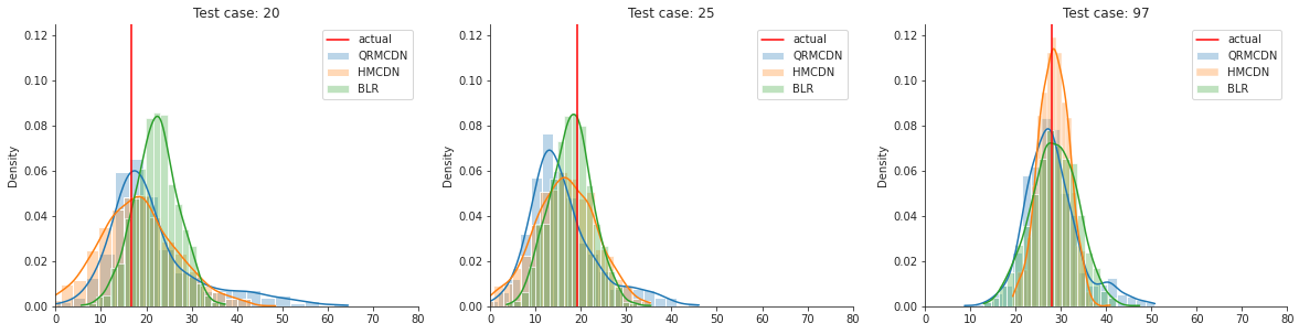
Lets start with a visual comparison. I’ll use the toy dataset from the last posts.
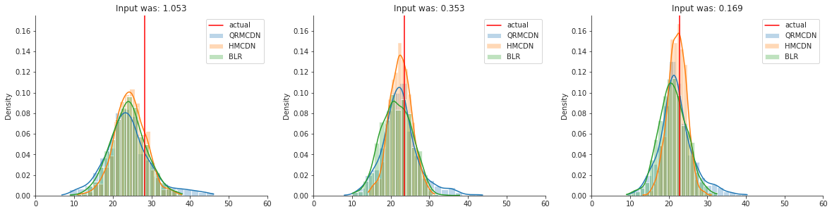
You can see that the three models perform quite similar. This is of course only based on looking at a few samples, but something I think is very nice, considering that there are two frequentist approaches and one Bayesian approach modelling prediction uncertainty. So, the three methods are kind of similar in terms of performance. But how to we evaluate them in more detail? That brings me to the next part: evaluating uncertainty.
Evaluation metrics
The most simple way of evaluating the model outputs, is taking the average of the predicted distribution and compare it with the ground truth. Here we can use all of our regular evaluation metrics like MSE or MAE. This method however, only says something about the location of the distribution (if symmetrical), and not something about the uncertainty itself. For our toy dataset, the MAE of the mean is as follows:
MAE - QRMCDN : 3.843
MAE - HMCDN  : 3.872
MAE - BLR    : 4.012
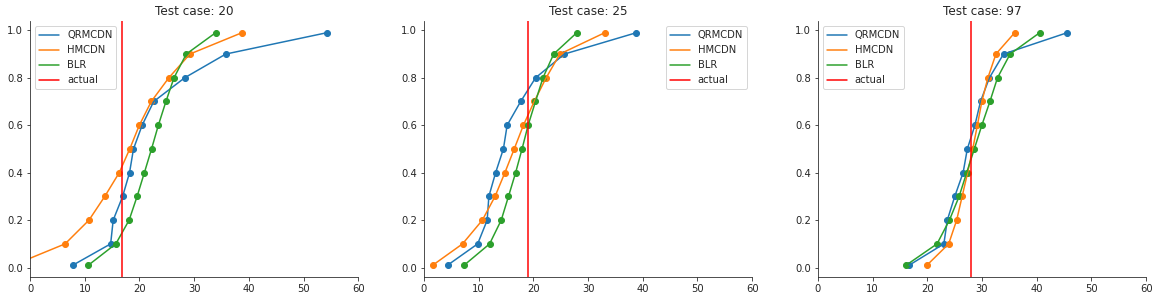
Here it seems that the mean of the two fequentist approaches are a little better than the bayesian approach. So how about the uncertainty? In order to evaluate this, I’ll use the Continuous Ranked Probability Score (CRPS). This metric calculates the area between the predicted distribution as CDF and the actual value as (Heaviside) step function. This sounds quite complicated, but makes more sense when looking at it visually:
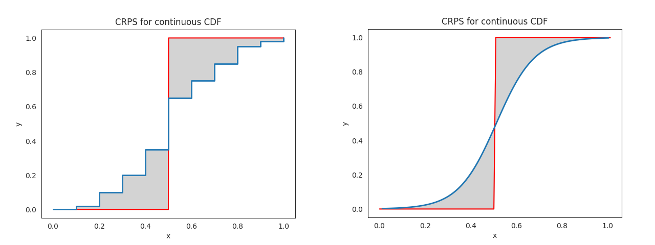
So when the location of the distribution is nicely predicted, but the uncertainty is high, the area will be rather large. This also happens when you predict the wrong location (maybe even more so). In order to get a good score (low), you need to predict the location right with a low uncertainty. That is something we would like to do! A nice property is that the metric prevents overly confident distributions. This means that it’s better to be uncertain but rougly right than (un)certain and way off, which makes a lot of sense I think.
Since we often can only draw samples from our predicted distribution, it’s hard to mathmatically calculate the area between the curves. Therefore we use an Empirical CDF[1] instead, which you can see on the right. You can calculate this area by hand of course. But I found a Python package called properscoring[2] that can calculate this for you. The package isn’t actively maintained anymore, but it still works. In order to compare the three methods equally, we will transform our predicted distributions to (CDF) quantile predictions.
With these values, we can use properscoring’s crps_ensemble() method. This will give you the following scores:
QRMCDN CRPS: 2.872
HMCDN CRPS : 2.810
BLR CRPS   : 2.925
The goal of this is not to show which model is best, since all three models are not fully optimised, but to show how similar they perform.
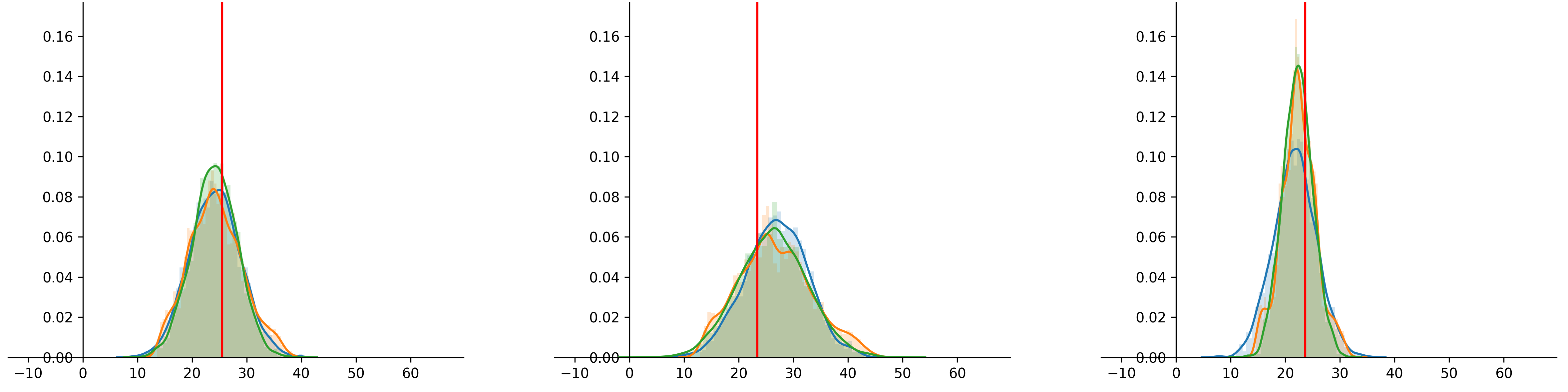
A more real life example
Lets try the Boston housing dataset, which is more realistic than our 2D example. The dataset contains multiple features to eventually predict the housing price. For now, I’ll skip the feature engineering / preprocessing step since the data is quite clean already, and not necessary for the goal of this blog.
The uncertainty differs a bit more compared to the toy dataset from before, but is still quite similar. How about the CRPS scores?
QRMCDN CRPS: 2.409
HMCDN CRPS : 2.270
BLR CRPS   : 2.409
Here we see that the HMCDN` model predicts best, and the other two equally good. Again, all three models can still be further optimised. Nice to see that our findings still hold after testing on a (slightly) more realistic dataset!
Discussion: Calibration
Now we know how to evaluate a predicted distribution with a single true value, but how well does the distribution represent reality? Does the predicted probability really reflect actual probabilities? One way to check this is by making a calibration plot (or Reliability plot). In order to make this plot, we have to get some quantile values from the predicted distributions. Then you can compare how well this quantile fits the actual quantile. In other words, when predicting the median (quantile .5) we expect that these predictions overpredict in 50% of the cases. The same holds for the other quantiles. If you calculate this for a set of quantiles, you can make the following plot:
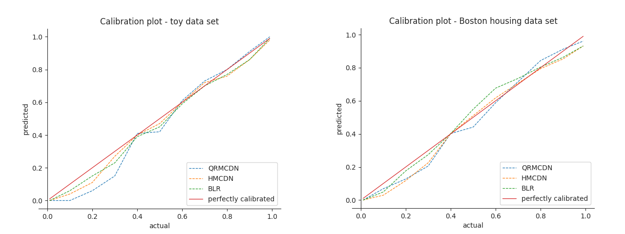
The better the curve fits the diagnoal, the better the predicted distributions are calibrated. The distributions predicted on the toy data are quite well calibrated, since the calibration curve is very similar to the diagonal. For the Boston data set it’s a bit more off. You can read this figure as follows. When we predict for quantile .8, we expect to overpredict in 80% of the cases. If we start at the y-axis on the right plot at 0.8, and move to the right until we hit the blue curve. Then go down until the x-axis, we can see that we actually only overpredict in 65-70% of the cases. Our higher quantiles seem to underpredict.
So what to do about this calibration error? We can of course try to optimise the model’s parameters, which will probably help, but can you actually adjust the model itself afterwards? That’s something I would like to find out.
In the last three posts, I’ve discussed two frequentist ways of calculating prediction uncertainty, some uncertainty evaluation methods and a comparison with an actual baysian model. It turned out that you can actually get quite similar results, with having the benefits of using familiar methods (feedforward neural networks) / packages (PyTorch`) for most data scientists, and scalability for bigger datasets. Let’s hope everyone will incorporate the uncertainty in predictions for regression tasks from now on!
References
[1] https://en.wikipedia.org/wiki/Empirical_distribution_function
[2] https://github.com/TheClimateCorporation/properscoring
[3] https://scikit-learn.org/stable/modules/generated/sklearn.datasets.load_boston.html